What Makes a Small Business Website Modern in 2026
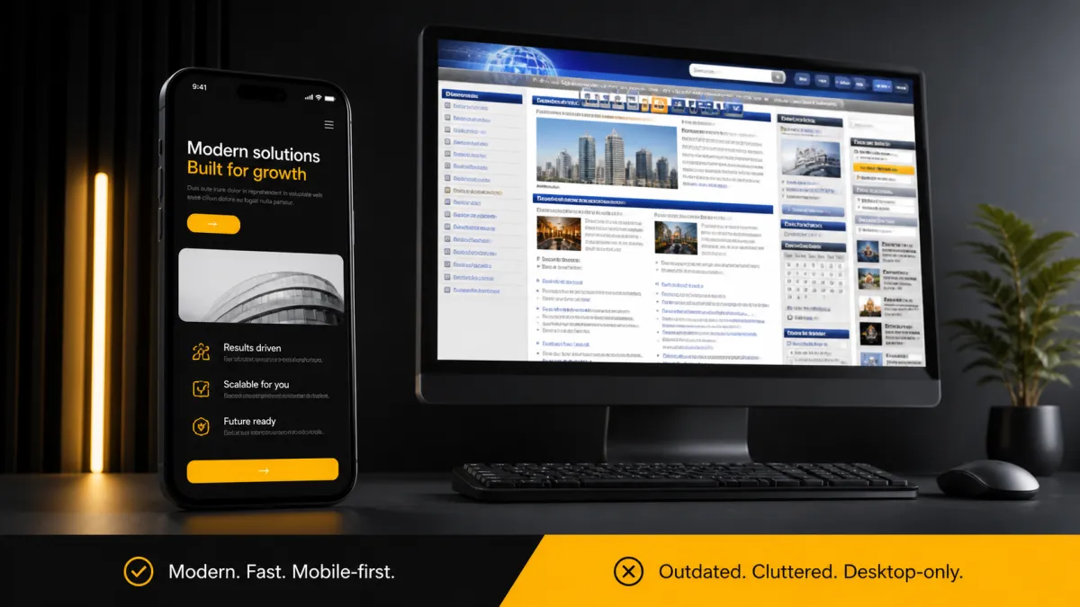
"Modern" gets thrown around a lot in website pitches, and it usually just means "new-looking." That's not wrong, exactly, but it misses what actually matters. A website can look current and still function like it's from 2015. A modern website in 2026 isn't about trend-chasing — it's about a specific set of things working the way people now expect them to.
Here's what actually separates a modern small business website from one that's quietly falling behind.
Speed is not optional anymore
People don't wait for slow websites. If a page takes more than two or three seconds to load, a real chunk of visitors will leave before they see anything at all. This has been true for years, but it's gotten less forgiving as expectations have kept climbing — everything else in someone's day loads instantly, so a slow website reads as broken, not just slow.
Speed comes from the basics: compressed images, clean code, no bloated plugins stacked on top of each other. None of that is glamorous work, but it decides whether someone sees your site or bounces off it before it finishes loading.
Mobile-first, not mobile-friendly
There's a real difference between a site that "works on mobile" and one that was actually designed for mobile first. Mobile-friendly usually means a desktop site that shrinks down and mostly holds together. Mobile-first means the phone experience was the starting point, and everything else was built up from there.
Since most local traffic comes from phones, this isn't a nice-to-have anymore. It's the primary way most of your customers will ever see your business. Our web design process starts with the phone screen for exactly this reason.
Clean and simple beats flashy every time
There was a stretch where "modern" meant animations on every scroll, video backgrounds on every page, and as many visual effects as a site could hold. That era is mostly over, and for good reason — all of that adds load time and confusion without adding much for the visitor.
What reads as modern now is closer to the opposite: clean layouts, clear typography, plenty of white space, and a design that gets out of the way of the message. The businesses that look most current today are usually the ones that resisted the urge to add more, not the ones that piled on effects.
Clear calls to action
A modern site tells visitors exactly what to do next, on every page. Call now. Book online. Message us. Get a quote. If someone has to hunt for how to contact you, or the site just ends with information and no next step, that's an old pattern showing through no matter how the page looks.
Good calls to action are specific, visible, and repeated where it makes sense — not just buried once in the footer.
Integrated tools instead of a static brochure

This is probably the biggest shift. Older websites were digital brochures — they told you about the business and that was it. Modern sites do more. They let people actually interact: chat with the business through webchat, send a quick message instead of dialing a phone during business hours, pay a bill through payments, or see real customer feedback through reviews instead of just a claim that the business is "the best in town."
A static brochure site tells people about you. A modern site lets them take action without leaving the page.
What this looks like put together
A modern small business website in 2026 loads fast, works cleanly on a phone first, keeps the design simple instead of cluttered, tells visitors clearly what to do next, and gives them a way to actually interact instead of just read. None of this requires flashy design tricks. Most of it is about removing friction, not adding polish.
How Velocity Designs builds for this
Every site we build starts mobile-first and gets tested for speed before it ever goes live. We keep designs clean on purpose — no clutter, no unnecessary effects, just a clear path from "landed on the page" to "took action." And we build in the tools that let visitors actually do something, whether that's messaging, booking, or paying, instead of just reading a page and leaving.
If your current site was built more than a few years ago, there's a good chance it's still functioning like a brochure even if it looks fine on the surface. Worth a second look.
What to do next
Pull up your website on your phone and time how long it takes to load. Notice whether it tells you clearly what to do next, and whether there's any way to interact with it beyond scrolling and reading.
If it feels more like a brochure than a tool, check out our web design page to see how we'd approach bringing it current.