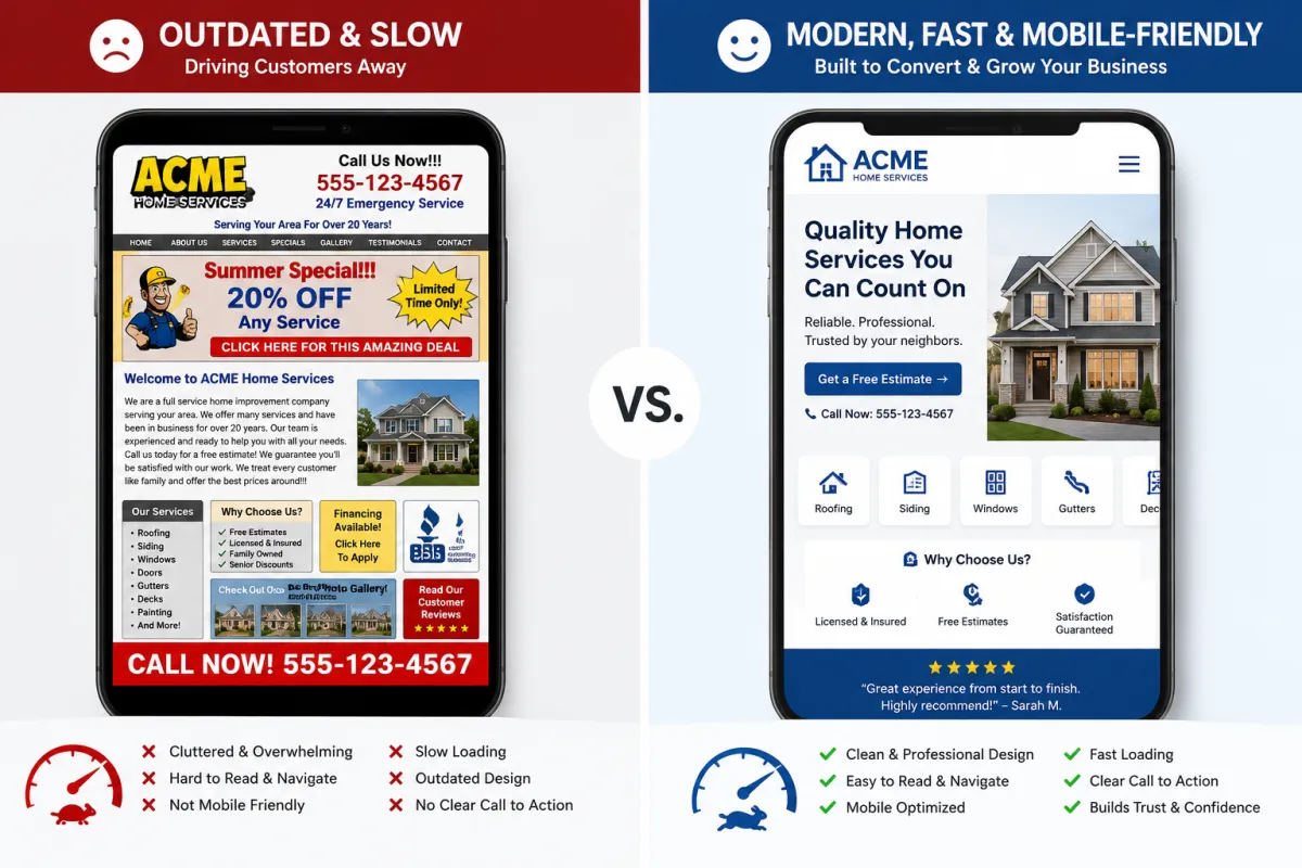
Signs Your Website Is Costing You Customers
Most small business owners think of their website the way they think of an old filing cabinet — it's there, it's not really helping, but it's not really hurting anything either. Just kind of... existing.
That's not actually true. A website that's slow, outdated, or hard to use isn't neutral. It's actively working against you every time someone visits and leaves without calling, without booking, or without trusting that you're still in business. The damage doesn't show up as an error message — it shows up as a phone that doesn't ring.
Here are the signs that your website has crossed over from "not helping much" to "actively costing you customers," and what fixing each one actually looks like.
1. It takes more than a few seconds to load
People don't wait. If your website takes five, six, ten seconds to load — especially on a phone, which is how most people are looking at it — a chunk of visitors will hit the back button before they ever see what you offer. They won't even know what they missed. They'll just be gone, and probably already looking at the next business in their search results.
Slow load times usually come from oversized images, outdated website builders, or sites that have had plugin after plugin piled on over the years without anyone cleaning things up. The fix is usually some combination of compressing images, simplifying the page, and in some cases, rebuilding on a cleaner foundation entirely.
What fixing it looks like: a site that loads in two seconds or less, even on a phone with a weak signal. You probably won't notice the difference yourself — but your visitors will stick around instead of leaving.
2. It doesn't work well on a phone

Most of your traffic — often 60% or more for local businesses — comes from phones. If your site was built years ago for desktop screens and never properly adapted, what looks fine on your office monitor might be a mess on a phone: text too small to read, buttons too close together to tap accurately, menus that don't open, or content that gets cut off the edge of the screen.
This is one of those problems that's invisible to you if you only ever check your site on a computer, but it's the first thing most of your customers experience.
What fixing it looks like: a site built to work on phones first, where everything is readable and tappable without pinching, zooming, or scrolling sideways. Our web design approach starts with mobile because that's where most people will actually see it.
3. The information on it is wrong or outdated
Old hours. A phone number that's been disconnected for two years. A "current promotions" section advertising something from 2023. A services list that's missing what you actually do now, or still listing something you stopped offering.
This one is sneaky because the website still looks fine — it's just wrong. And wrong information actively sends people away. Someone shows up at your door because the website said you're open, and you're not. Someone calls a disconnected number and assumes you've closed. Someone looks for a service you now offer and doesn't see it, so they go find someone who does.
What fixing it looks like: a quick audit of every piece of information on your site — hours, contact info, services, service area, pricing if it's listed — checked against what's actually true today. This takes maybe an hour and can be the highest-value hour you spend on your website all year.
4. There's no easy way to actually contact you
Some websites make you hunt. The phone number is buried in tiny text in the footer. There's no contact form, or there is one but it's broken. There's no way to ask a quick question without picking up the phone during business hours.
Every extra step between "I'm interested" and "I reached out" is a chance for someone to give up and move on to a business that made it easier. This matters even more for the customers who'd rather text or message than call — if that's not an option, you're losing them before they ever become a lead.
What fixing it looks like: a clear, visible way to get in touch from every page — phone number, contact form, and ideally something like webchat or messaging for people who'd rather not call. The goal is zero friction between "interested" and "in touch."
5. There's nothing on the site that builds trust
When someone lands on your site for the first time, they don't know you. They don't know if you're reliable, if your work is good, or if you'll show up when you say you will. Your website is often the only thing standing between "never heard of this business" and "I trust this enough to call."
If there's nothing on your site that builds that trust — no reviews, no photos of actual work, no real information about who you are — you're asking people to take a leap of faith. Some will. Most won't, especially when there's a competitor one click away whose site does show reviews and real work.
What fixing it looks like: reviews displayed where people can actually see them, photos of real jobs (not stock images), and some sense of who's behind the business. None of this needs to be elaborate — it just needs to be there.
6. It doesn't show up when people search for what you do
This is the quiet one, because you might never even know it's happening. If your website isn't set up properly for search — missing the basics that help Google understand what you do and where you do it — you're invisible to the people searching for exactly your services in your area. They're not finding you and going somewhere else. They're just never finding you at all.
What fixing it looks like: the SEO fundamentals — proper page titles and structure, location-specific content, fast load times (see #1), and a Google Business Profile that's complete and active. None of this is flashy, but it's the difference between a website that exists and a website that brings in business.
## How Velocity Designs approaches a rebuild
When we look at a website that's working against a business instead of for it, we don't usually start by tearing everything down. We start by figuring out which of these six things are actually happening — sometimes it's one or two, sometimes it's most of them — and what fixing them would realistically do for the business.
From there, the rebuild is built around your customers: what they're searching for, what they need to see before they trust you, and what makes it easy for them to take the next step. That means fast, mobile-friendly, accurate, easy to contact, trustworthy, and findable — the opposite of all six signs above.
What to do next
Pull up your website on your phone right now, away from your office wifi, and look at it the way a stranger would. Is it fast? Does it look right? Is everything still accurate? Can you find your phone number in two seconds?
If something feels off, you're probably not imagining it — and it's probably costing you more than you think. Get in touch and we'll take an honest look at what's working, what isn't, and what it would take to fix it.